


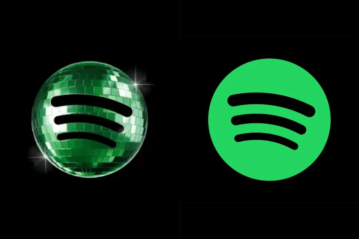
Spotify recently surprised users by replacing its iconic green logo with a shiny disco ball-inspired icon - and the internet instantly had opinions. While some users called it fun and nostalgic, others said the new design looked confusing, messy, and completely unnecessary. The temporary logo change quickly went viral across social media.
The redesign is part of Spotify’s 20th anniversary celebration, where the platform is pushing a retro party aesthetic inspired by disco culture and nostalgia. Alongside the new icon, Spotify also launched features that let users revisit their oldest songs, most-played artists, and entire listening history over the years.
But instead of focusing only on the nostalgia campaign, social media became obsessed with the logo itself. Many users joked that the icon looked like an app stuck in “loading mode,” while others compared it to AI-generated designs or old-school party graphics from the 2000s.
Interestingly, several brands also joined the trend by posting their own funny “disco ball” logo versions online, turning Spotify’s redesign into a full internet meme moment.
Even with the backlash, the campaign successfully grabbed massive attention online - proving once again that even small app changes can dominate internet conversations today.


Post a comment


From the Birth of Ustad Bismillah Khan to the End...
A day of profound cultural and political resonance, March 21 celebrates the birth of Bharat...
Rare March Fog Descends Amid 3-Day Spell of Rain and...
A sudden and unusual weather shift has gripped the National Capital Region (NCR), bringing a...
Turning India’s Trash into Data Gold!
A Bengaluru-based deep-tech startup is tackling India’s massive waste crisis by deploying AI-powered computer vision...
How to Read Anyone in Minutes and Boost Your Professional...
In a high-stakes business environment, the ability to decode non-verbal cues is as critical as...


